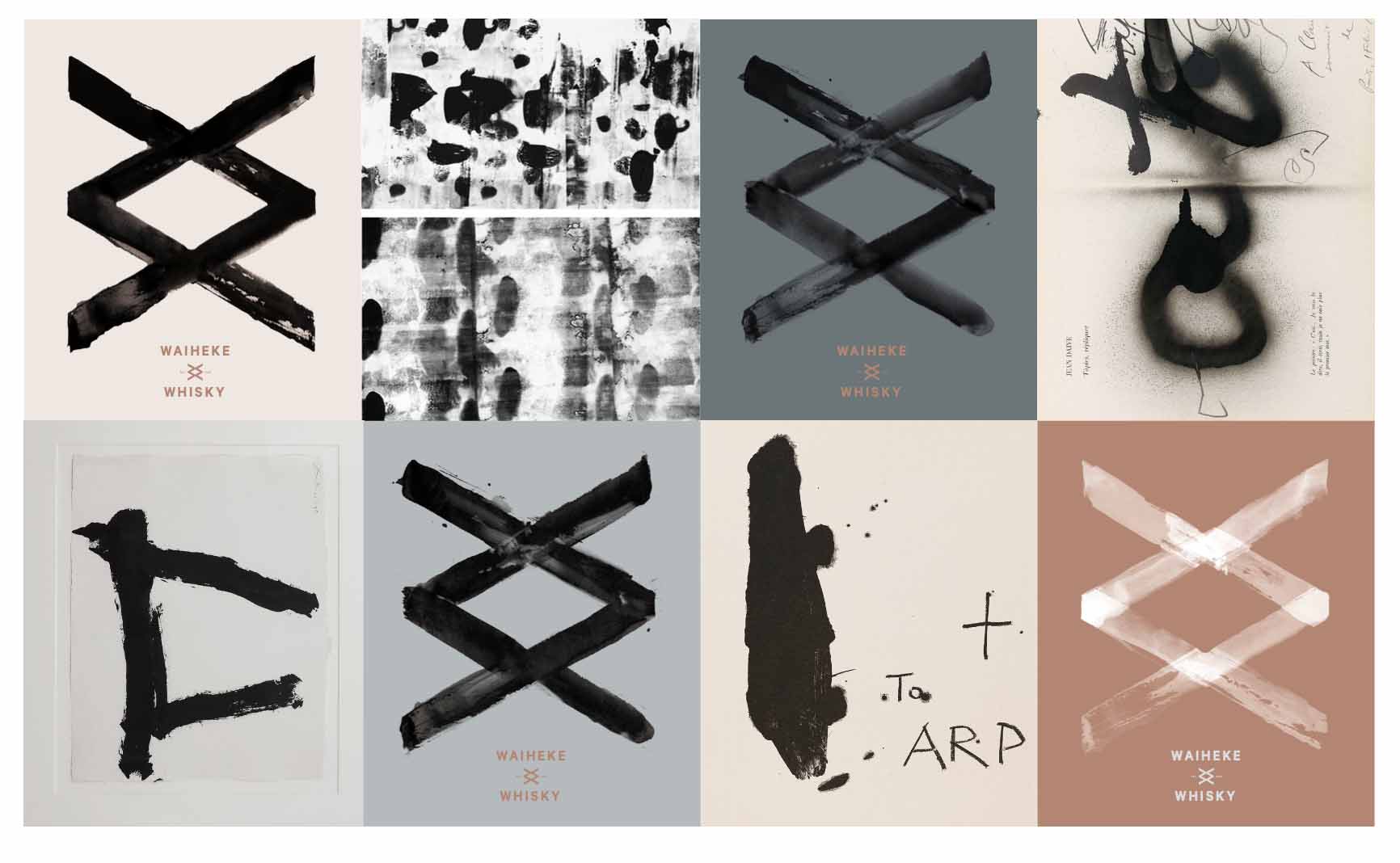
Evolution of our logo & brand identity.
At Waiheke Whisky, we love to talk about our story, what we stand for as a brand. We've had lots of time to think about things as we made whisky and waited for it to age. We are at heart a group of whisky geeks and we bring a passion for science, art, history and nature into our hobby. One thing we didn't dwell on however was brand, we didn't want to be another spirits label created by a brand agency or a team of advertising execs.
Over the years we played around with a few concepts but nothing really resonated with us until we met Campbell Hooper. He was introduced by a good friend, Stephan Jelicich, from Chandler, who was designing our bottle for us.
Cam is a polymath artist, designer, director and photographer and all round super nice guy. After visiting the island and a few meetings in a local pub in Auckland, Cam outlined his ideas of how he saw us, our brand and what we were doing.
Simply put, we are not Scotland, but we are more Scotland than pretty much anywhere else on the planet, a sort of parallel universe of the northern hemisphere, same goes for the whisky too. There are huge similarities in landscape, climate and culture in various parts of NZ. Whilst we mirror the northern hemisphere it is not a direct refection. Things are different and its a new lens we look though as far as our whisky and attitudes are concerned. Our climate is different, our organic barley, our peat, our water; it's similar, but not the same.

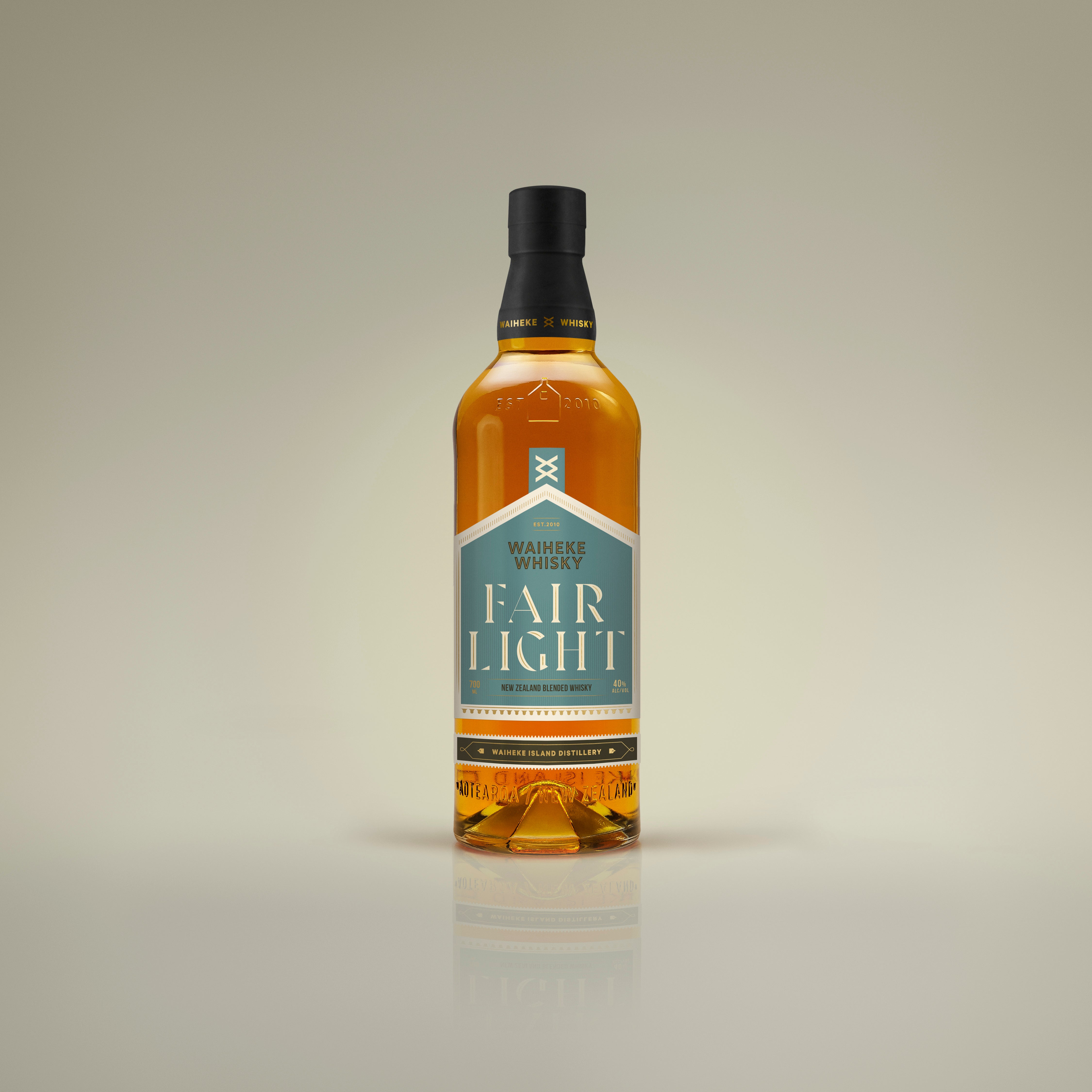
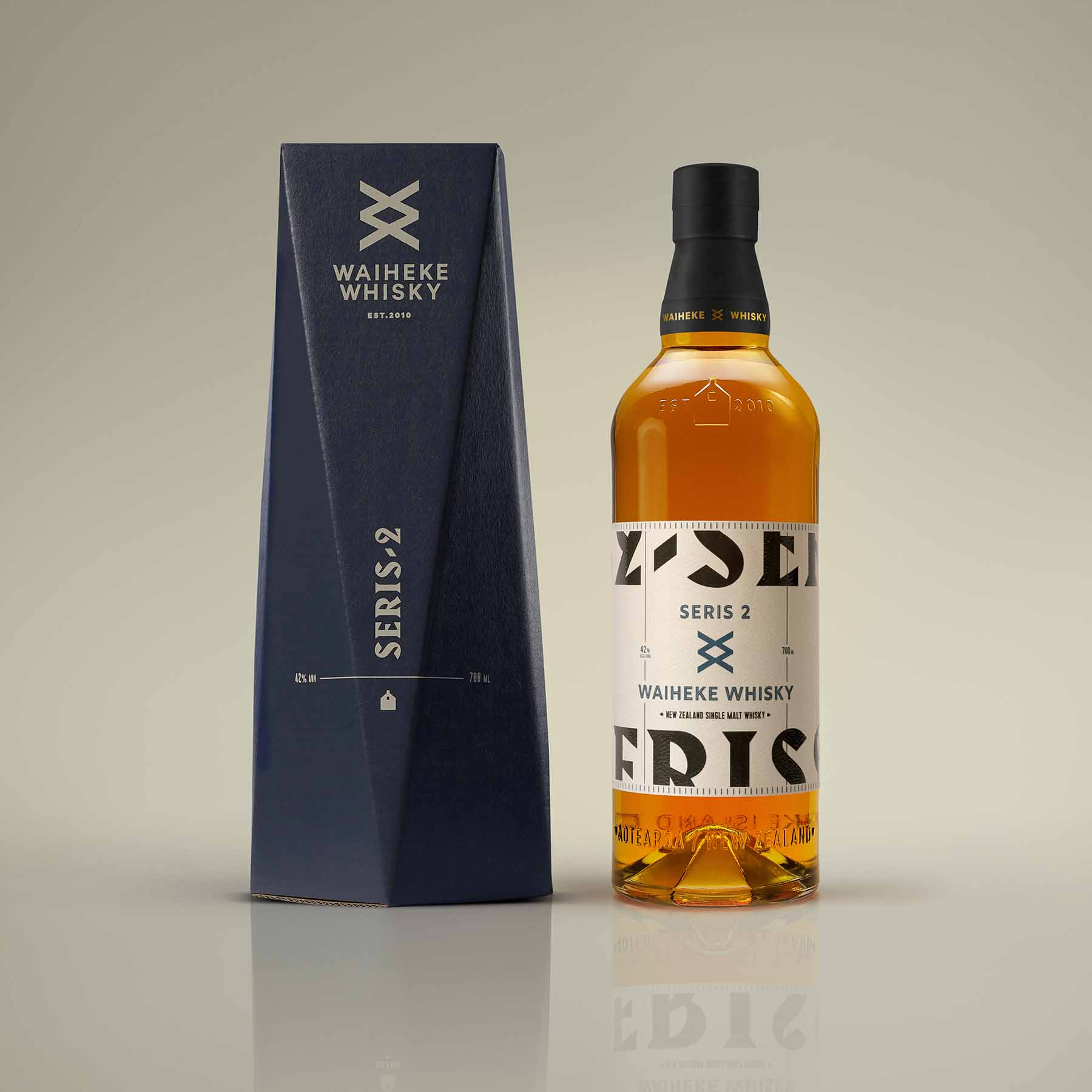
So we needed a logo that reflected this twisted nature of things. It needed to be simple, honest and us. We think he nailed it first time, the two W's of Waiheke Whisky and mirrored and then rotated. Some call it 2 X's or a the rune shape Ingus. This is entirely coincidental, it's just the simplicity of the 2 W's that are at our core.
Its whisky Jim, but not as you know it....